Why we built the Schumann Aura
The original Tomsk diagram is what most people find when they go looking for the Schumann resonance online. It is a dense, multi-layered spectrogram, and it does show the truth, but the truth is hidden in plain sight. Reading it well takes practice. Misreading it does not. A great deal of what circulates on social media about the Schumann resonance starts with a confident screenshot of a diagram the sharer did not actually understand.
The Aura came out of that frustration. The same underlying data already exists as three separate diagrams, one for resonance frequency, one for amplitude, one for Q factor, and almost no one wants to read three diagrams at once. So we folded them into a single visual language: one harmonic per ribbon, one picture for the whole day. Same signal, much less room for invention, and no part of the story left on a graph you never opened.
Reading the ribbons
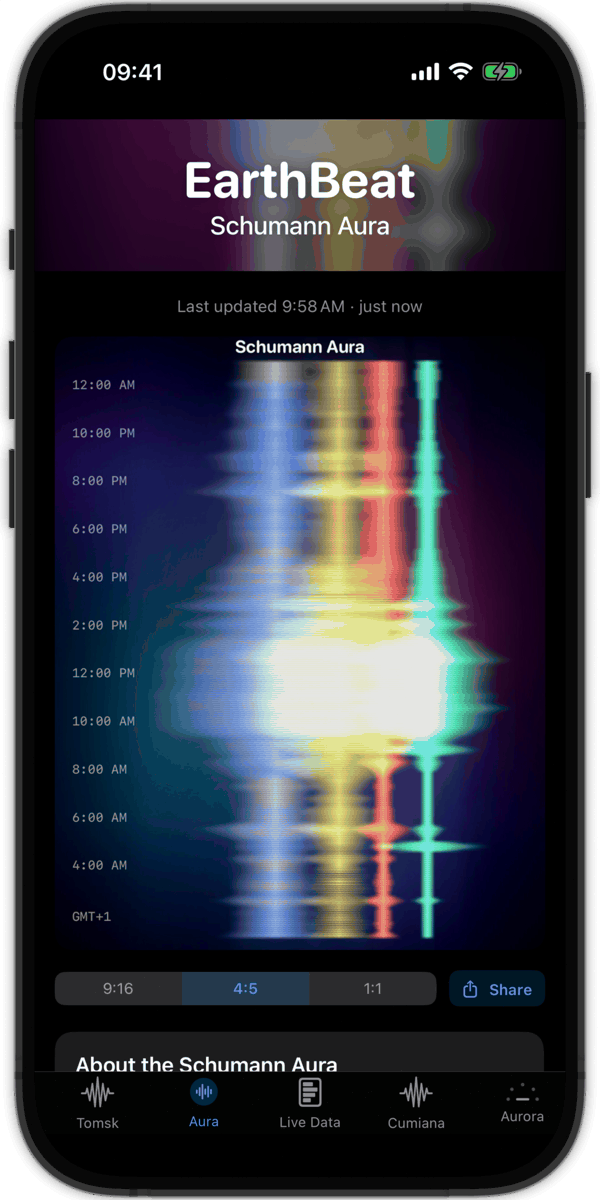
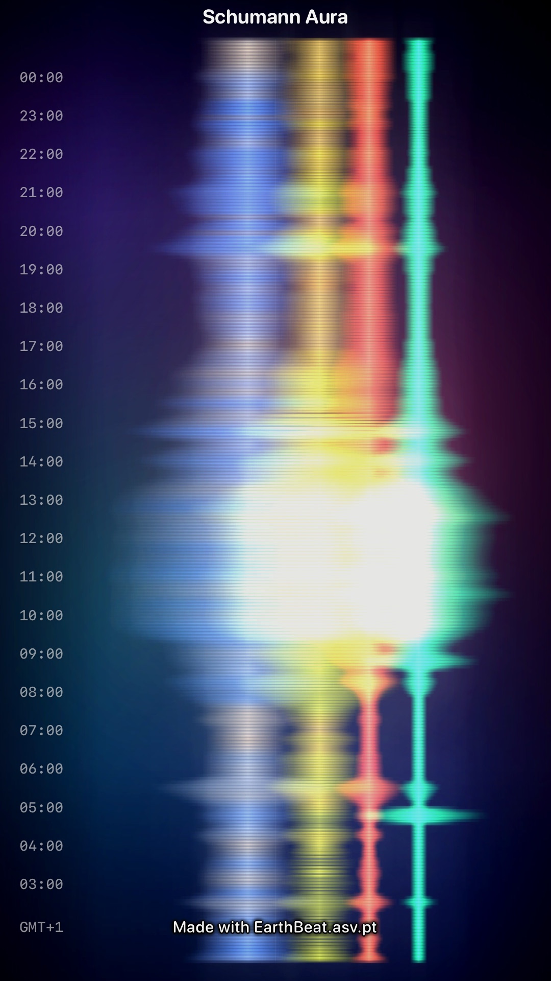
Four ribbons, four harmonics. The fundamental H1 is Earth's deepest voice, hovering around 7.83 Hz. Above it sit H2, H3, and H4, each with its own characteristic frequency. In the Aura, every harmonic has its own base color, and then everything moves. When a harmonic drifts above its usual frequency, its color warms; when it drifts below, it cools. Nothing stands still, because the harmonics themselves never stand still. They are always moving around their core frequencies, and the Aura moves with them.
How loudly a ribbon speaks is given by its horizontal length. A short ribbon is a quiet harmonic. A long one is carrying more energy.
How cleanly a ribbon speaks is given by its Q factor, and this is where the musical analogy is literal. On a studio equalizer, the Q parameter decides whether your filter is a sharp spike or a broad hump. On the Aura, a high Q ribbon is a thin, sharp line, the field resonating cleanly. A low Q ribbon blooms into a soft, hazy glow, the field unsettled, harder to lock onto. You can read the mood of the resonance the same way you read the shape of a note.
Color reference
Each harmonic has its own base color at its center frequency, and shifts smoothly toward a cooler hue as it drifts low and a warmer hue as it drifts high. The thresholds below mark where each ribbon reaches its full color expression. Anything in between renders as a partial blend of the two.
| Harmonic | Low (cooler) | Center | High (warmer) |
|---|---|---|---|
| H1~7.83 Hz | ≤ 7.25 Hz | 7.83 Hz | ≥ 8.40 Hz |
| H2~14.3 Hz | ≤ 13.5 Hz | 14.3 Hz | ≥ 15.1 Hz |
| H3~20.8 Hz | ≤ 19.8 Hz | 20.8 Hz | ≥ 21.8 Hz |
| H4~27.3 Hz | ≤ 25.8 Hz | 27.3 Hz | ≥ 28.8 Hz |
H1 is special: at rest it sits as a near-white wash with no color cast. The other three keep their base hue at center and shift around it. Once you have spent time with the table, the Aura begins to read like a clock: a glance tells you which harmonic is speaking, and which way it is leaning.
What you start to see
Once you have looked at the Aura for a while, certain things jump out at you that the raw spectrogram tends to bury.
A single harmonic going off-normal is very easy to spot. When one ribbon warms or cools while the others sit quietly, the picture becomes asymmetric, and your eye catches it immediately. Try that in a spectrogram and you are squinting at four horizontal stripes trying to work out which one moved.
Peaks are easier to read, and so are the quiet days. On a calm day the old spectrogram can look like an almost blank rectangle, but calm days are not silent, they just have subtle structure. The Aura keeps that subtle structure visible. The glow thins, the ribbons tighten, and you can still read what the planet is doing. Noise in the calmness is where a lot of the interesting behavior hides.
And, frankly, the Aura is easier to relate to. The raw spectrogram is a page of numbers dressed up as a picture. The Aura is a picture that happens to be made of numbers. That shift changes how you spend time with it. You look at it longer. You notice more. You start to recognize a day.
Your local time, on purpose
The Tomsk observatory records everything in Siberian time. The Aura puts the clock back into your hands. The labels down the left side of the image are rendered in your own local timezone, so "four in the morning" means four in the morning wherever you are. You can open today's Aura and see what the field was doing while you were asleep, in your own hours. Small choice, large difference in how the graphic lands.
Widgets, sharing, and the point of making it beautiful
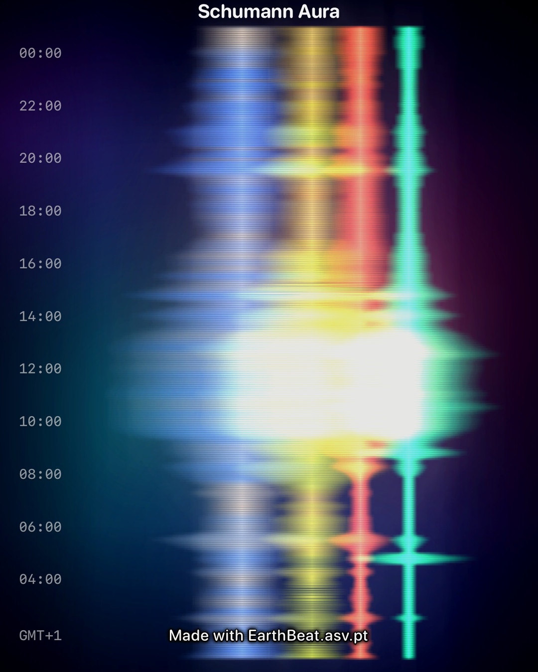
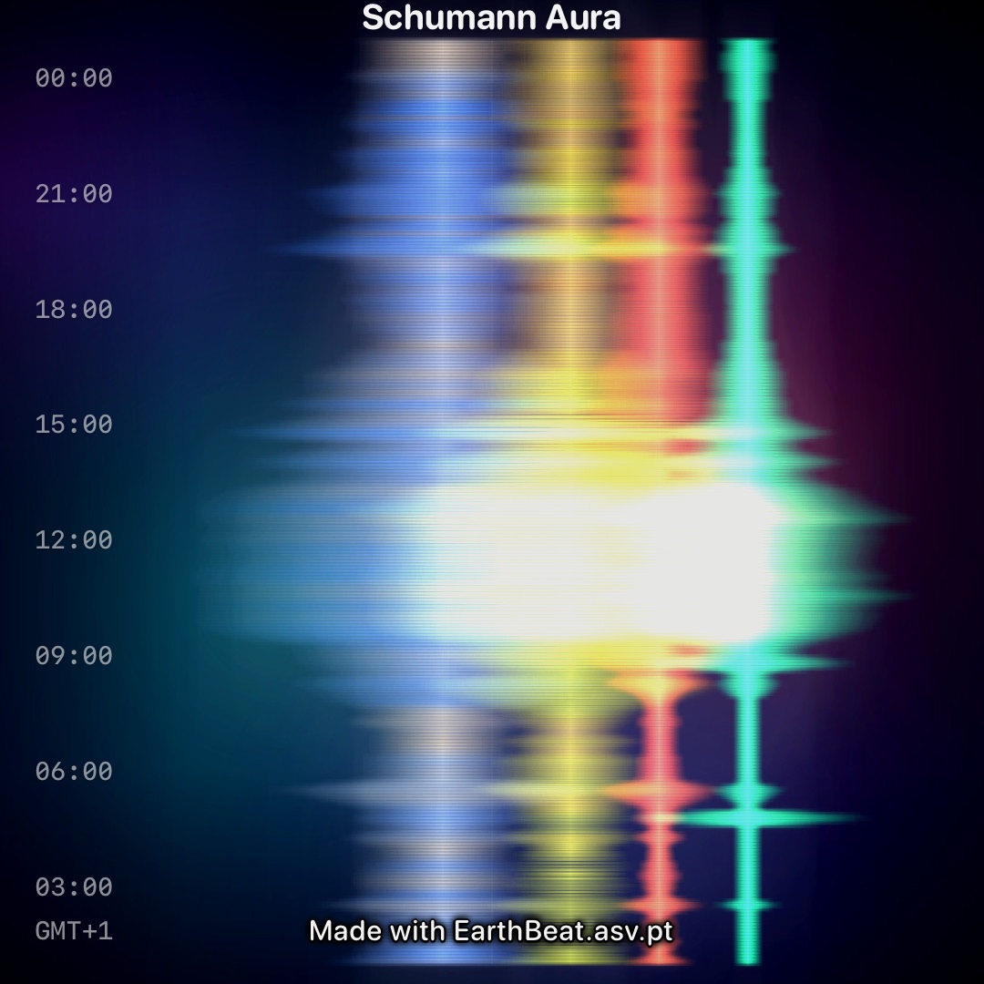
The Aura ships three ways. Inside the app as a full-screen view. On your home screen as a 1:1 widget. And as an exportable image in three aspect ratios: 9:16 for a Story, 4:5 for a Post, 1:1 for a Square crop. You never have to type anything, you just tap Share.
We made the Aura easy to share on purpose. The raw Tomsk spectrogram is a deeply uninviting thing to put in anyone's feed. The Aura is not. If someone in your practice community or your family wants to know what today's heartbeat looked like, now you can send it to them and it will actually be read. If that also happens to introduce a few new people to EarthBeat each week, that is fine with us. EarthBeat is meant to be a companion to your daily routine, the kind of app that gives you signals you will not find anywhere else. The Aura is the friendliest face that signal has.
Why "Aura"?
The name is deliberately doubled.
In one sense, the Schumann resonance really is an aura of the Earth. It is an electromagnetic field that surrounds every one of us, every moment, whether we attend to it or not. Focus on it and it is there; ignore it and it is still there. That matches very closely how the word "aura" is used in the spiritual traditions. Not as something magical, but as the quiet field that surrounds a living body.
In another sense, once the graphic was drawn, it looked like aura readings. The ribbons warm and cool and bloom in ways that remind me of how people describe seeing auras: bands of color that are not separate objects but the same field expressing itself at different frequencies. That rhyme was not designed in. It emerged. The naming was already done before I put the two together, and that felt about right.
A note from the creator
I built the Schumann Aura myself, start to finish. The idea, the math, the rendering pipeline, the colors, the share flow, every choice. It is EarthBeat's only completely home-grown visualization, and it is the piece of the app I am proudest of. I am putting it into the world free, because I would like more people to find their way into the Schumann resonance, and because the raw Tomsk diagram has been quietly scaring them off for years.
Spend some time with it. Sometimes the Aura is like a mirror. What you see in it often has as much to do with the day you are bringing to it as with the field itself.